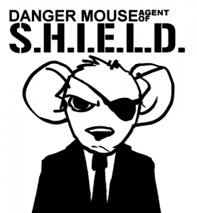
Three photographs, one classic cartoon character meets modern spy agency illustration and a minimalist interpretation of a Blue Rogue Air Pirate.
The first photograph is titled “Temporary eclipse…” by Kipppics, which the photographer states was “created by the big whale of the east.” Whether the plane is landing or taking is your preference to glass half full or half empty. However, the moment of that wing clipping the light of the sun is fantastic.
Kripppics is Chris Hijdra from the Netherlands and his deviantArt gallery has quite the collection of aviation photography. His use of black and white images, as well as, color photography captures the spirit and adventure of flying, whether the planes are on the ground or in the air.
Danger Mouse is one of the classic cartoons from the 1980’s. The show is a loose parody of James Bond and other British Spy fiction. So, what better to make him relevant again than to make Danger Mouse, the Spy with the eye patch into a Nick Fury character by enlisting him as an Agent of S.H.I.E.L.D.
This piece is done by Kev H, a.k.a. bighatdino on deviantArt. The description states that he was “idly sketching Danger Mouse (DM to his friends), when I realised how much he appeared like Nick Fury… or Nick Furry.” And I couldn’t agree more.
The brilliance of this design is that while I enjoy Agents of S.H.I.E.L.D. in its present live-action form, I would think it beyond compare if Danger Mouse showed up next week. Think about it, epic, right?
The next photograph is entitled “Lightway” by Jan Berounský from the Czech Republic, known as BandasPhoto on deviantArt.
First off, this is a great piece of long exposure photography, which not only captures the car illuminations, but top center in the sky appears to be a star or planet. But that’s not what makes this photo great.
Where is the other traffic? Why is only one side of the highway in use? Was there an accident? Is everyone really trying to go somewhere at the same time? If so, how come no one has returned? Looking at this photo, those questions and more hypotheses come to mind. Good art looks nice, but great art makes you think and this does that.
I don’t carry a watch anymore, but if I did, it would be a pocket watch. There is something I like about pocket watches that wristwatches don’t have. That being said, this photograph by Bradley Sharp, MySharpify on deviantArt, titled “Slipping away” is great.
“Slipping away, day by day, I just came to say, time is slipping away,” is the description and it just fits. Both the photograph and description sentiments are ones that we feel everyday. There is never enough time and it is forever slipping away from us.
Lastly, I present to you a piece by Brandon a.k.a. Oldhat104 on deviantArt. This piece is a minimalist representation of Vyse, the Blue Rogue Air Pirate from the Skies of Arcadia game.
It was by request according to the description and I’m fangasming because it was requested, as it is a brilliant minimalist approach to Vyse. Minimalism has taken the graphic arts by storm, but Brandon has still managed to maintain a level of detail not scene in many minimalist pieces.
This isn’t a surprise as Vyse is hardly the first minimalist wallpaper Brandon has done. In fact a very large number of his 600+ deviations on deviantArt are minimalist representations of characters.
Above are five more examples of the kind of talent found on deviantArt, when you get past all of the junk. These represent the kind of small oddities that are enjoyable to come across in your journey through the interwebs.


