From video games to television, science and technology to the spy, and even a glimpse of the fantastic, here are five pieces from deviantArt.com that are simply extraordinary.
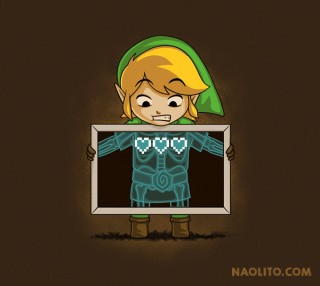
“Anatomical Anomaly” by Nacho Diaz Arjona a.k.a. Naolito is not for the faint of heart! Obviously, the gamers who see this get it, and the others only half-heartedly get it.
I look at this and think… “What’s that x-ray going to look like after a completionist plays and gets ten heart containers?” Seriously, there doesn’t appear to be enough room in Link for 10!
But still, Nacho has captured the anomaly in a brilliant way. This isn’t any Link, it’s Toon Link, with three pixalated hearts and I think his face is priceless. Seriously, Link, it’s been over 20 years! In all that time you’ve never felt your multiple hearts beat? But what’s just as amazing as this piece is that he’s got even more stuff on his site, Naolito.com titled Funny Pop Culture T-Shirts.
From the mind of Futurama fan Yen-Chih Lin comes “Omicronian Express,” from Omicron Persei 8 ruled by Lrr and Ndnd.
Of course, this isn’t just another spoof on the Planet Express logo. It’s a great spoof of the Planet Express logo, using the only ship in the entire Omicronian fleet. Seriously, take a look, they always show up in the same ship.
Anyway, this is brilliant and, for some reason, the yellow outline on the ship appears to really make this pop. It’s a little detail that really has a big impact.
Looking at the big picture, this logo begs one monumental question; “If you were looking to ship a package in the future and didn’t want to use the big conglomerate of Mom’s Friendly Delivery Company, would you use Planet Express or Omicronian Express?” Personally, it’s a tossup…
Minimalist design is hard to do well, but here is minimalist Agent, now Director, Coulson of SHIELD.
Everyone’s favorite Agent-turned-Director from the Marvel Cinematic Universe is a work of beauty in this minimalist design. Just a SHIELD logo and Coulson looking awesome, because that’s the only look he has!
This is not Alice Wieckowska a.k.a. nati-nio‘s first minimalist design. It’s just one of many from television, movies, fantasy, Disney, and more, that she nails with the utmost (or leastmost) detail. So why of all those options did I choose Phil Coulson? Because I’m enthralled with the Marvel Cinematic Universe, and Agent Coulson plays an integral role in it.
Also, as a fellow agent, I find that Agent Coulson is on top of his game all the time. The man is always on point and still manages to keep what’s left of his humanity in check. That’s something we can all aspire to do.
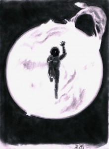
I have always been fascinated by the fact and fiction of space exploration, which is why this piece by Jëff from Germany, a.k.a. Prome-he-us, called “Into the Sun,” intrigues me.
Obviously, this astronaut or cosmonaut, if you prefer, was close enough to the sun to get sucked in my its gravity, but why was this person so close to the sun in the first place? The possibilities for that answer are limitless as of now, but you can ponder away.
This piece was done free hand with several pencils and is so greatly detailed that looking at it, I wonder what the light in the helmet is? What is it that this person is reaching out to for help? And does that person or persons even have the ability to save this lone soul, without endangering the mission? What was the mission to begin with?
Great art makes you think, and this does it every time I see it. In fact, I don’t know why it took me so long to write about this piece as it has been in my deviantArt favorites folder since 2011.
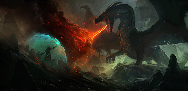
This last piece is a classic trope from fantasy. Man or Knight or Wizard or Mage or Sorcerer vs. Dragon.
It’s been done so many times, in so many different formats that it’s pretty much a classic of many different forms of communication. But this piece “Dragon” done by Saeed Ramez takes a place in my Small Oddities because not only is it detailed in all the right places, it looks like something it is not.
This is classified on deviantArt as “Digital Art / Paintings & Drawings / Illustrations / Conceptual” but it looks like something done in a traditional art style. It has an earthy quality that is usually only found in actual paintings, not digital ones. That’s all there really is to say – no funny business, no quip. It’s a stunning digital painting that comes across as so much more.
Also, it has a dragon, but still, any digital painting that looks traditional is exceptional in my book.
So there you have it, a digital painting that looks traditional, gravity taking its proper course, a minimalist Agent, a delivery company from another planet, and an anatomical anomaly.
